Are you curious about analyzing stock prices with Python? In this tutorial, we’ll learn how to fetch stock market data using an API and then visualize it with the help of Matplotlib.
By the end of this blog, you’ll be able to enter any stock symbol and see its opening price trend plotted beautifully.
🔧 Prerequisites
Before we start, make sure you have Python installed along with the following libraries:
pip install requests matplotlib
- requests → helps us call APIs and fetch stock data.
- matplotlib → allows us to plot and visualize data.
📥 Step 1: Get the Stock Data
We’ll use the Marketstack API which provides free access to real-time and historical stock data.
Here’s the Python code to fetch data:
import requests
import matplotlib.pyplot as plt

# Ask user for stock symbol
symbol = input("Enter a stock symbol: ")

# Marketstack API endpoint
url = "http://api.marketstack.com/v2/eod?access_key=yourkey&symbols=" + symbol

# Call the API
response = requests.get(url)

# Convert JSON response to Python dictionary
data = response.json()
stock = data['data']
👉 Here, we call the Marketstack API, pass the stock symbol, and convert the JSON response into a Python dictionary.
📅 Step 2: Extract Dates and Open Prices
We’re interested in plotting the opening price of the stock for the last 100 days.
dates = []
open_prices = []

# Append values to lists
for i in range(0, 99):
    dates.append(stock[i]['date'])
    open_prices.append(stock[i]['open'])
Now, dates contains stock market dates and open_prices contains the opening values.
📈 Step 3: Plot the Stock Chart
Finally, we’ll use Matplotlib to plot the stock opening price against dates:
plt.figure(figsize=(20, 5))  # Set figure size
plt.plot(dates, open_prices) # Plot line graph

# Add title and labels
title = symbol + " Stock Price"
plt.title(title)
plt.xlabel("Date")
plt.ylabel("Open Value")

# Show the graph
plt.show()
This will generate a line chart of stock prices, making it easy to see trends at a glance.
✅ Full Python Code
Here’s the complete code together:
import requests
import matplotlib.pyplot as plt

symbol = input("Enter a stock symbol: ")
url = "http://api.marketstack.com/v2/eod?access_key=yourkey&symbols=" + symbol

response = requests.get(url)
data = response.json()
stock = data['data']

dates = []
open_prices = []

for i in range(0, 99):
    dates.append(stock[i]['date'])
    open_prices.append(stock[i]['open'])

plt.figure(figsize=(20, 5))
plt.plot(dates, open_prices)
title = symbol + " Stock Price"
plt.title(title)
plt.xlabel("Date")
plt.ylabel("Open Value")
plt.show()
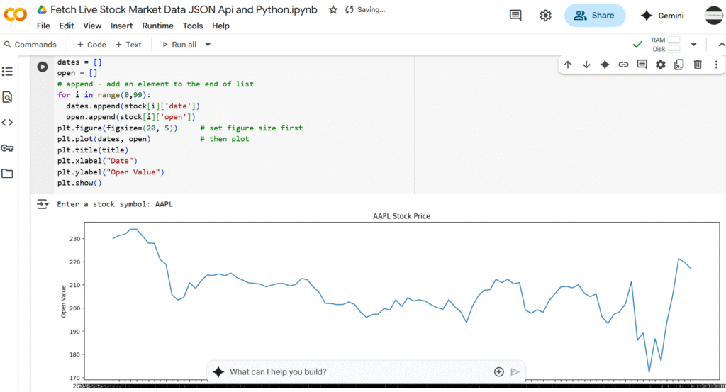
🚀 Output
When you run the script, enter a stock symbol (for example: AAPL for Apple, MSFT for Microsoft), and you’ll see a beautiful line chart showing the stock’s opening prices over time.
🎯 Final Thoughts
This small project demonstrates the power of Python for data analysis and visualization. With just a few lines of code, we pulled live stock data from an API and turned it into meaningful insights.
Next, you can enhance this project by:
- Plotting closing prices along with opening prices.
- Adding moving averages for trend analysis.
- Comparing multiple stocks in one chart.
The possibilities are endless when you combine APIs with Python!