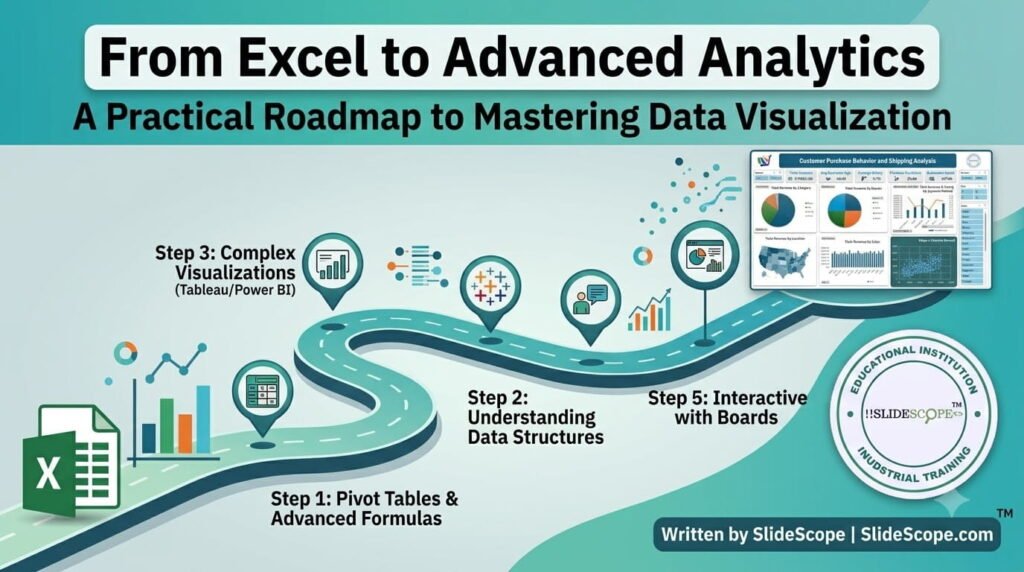
The Evolution Journey
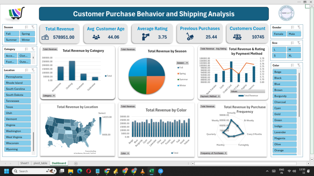
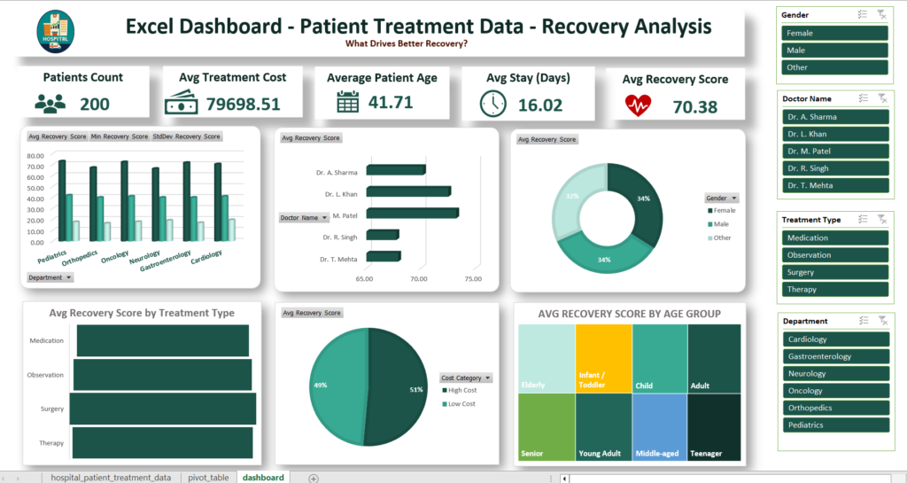
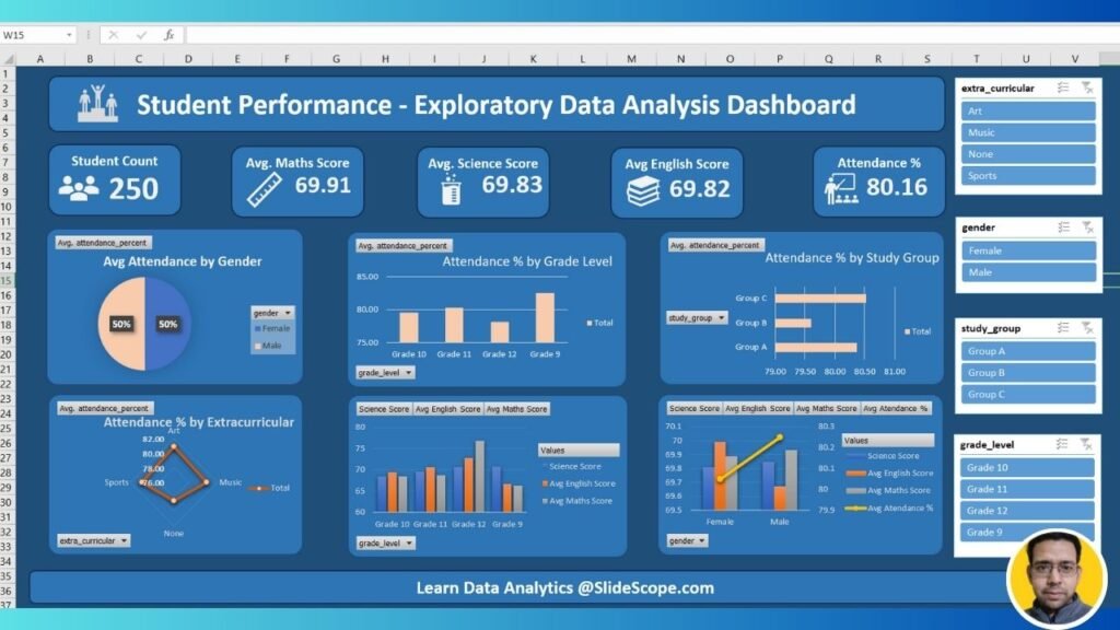
I still remember the first dashboard I built in Excel for a client in the jewelry manufacturing sector. It was a simple monthly sales report, colorful charts, and some pivot tables that seemed impressive at the time. Little did I know that this would be the beginning of a journey that would span over 300 dashboards and traverse through some of the most demanding data visualization challenges imaginable.
After working with 300+ Excel dashboards for clients ranging from jewelry manufacturers to hospital management systems, I realized the limitations. Excel is extraordinary for what it is—a quick-and-dirty analysis tool, a prototype canvas, and for many, the first love in the world of data. But as the datasets grew, as the need for real-time updates became pressing, and as the stakeholders demanded more interactivity, Excel’s boundaries became increasingly apparent.
The evolution doesn’t mean Excel is “bad.” Far from it. It means that like any tool, it has its appropriate context. The journey from Excel to advanced analytics is not about discarding what worked before; it’s about understanding when it’s time to move to the next level and having a roadmap that makes that transition smooth and purposeful.
Why Each Tool Matters
The progression I’ve followed—and seen countless students and professionals follow—follows a natural logic. Each tool addresses specific pain points of its predecessor while introducing new capabilities.
Excel remains the universal starting point. Its ubiquity means almost anyone can open a file and start analyzing. For small datasets, quick calculations, and one-off reports, nothing beats the immediacy of Excel. I’ve built HR & Payroll Management ERP dashboards in Excel where the dataset was under 10,000 rows and the primary need was quick slicing and dicing by various dimensions. Excel served perfectly.
Power BI entered my workflow when clients started asking for real-time dashboards. The jewelry manufacturing client who initially wanted an Excel dashboard later asked for live sales data across multiple showrooms. That’s when Power BI’s connection capabilities, DAX formulas, and refreshed dashboards became invaluable. Building the School Management System USA ERP taught me how Power BI can handle multiple data sources—Excel files from different campuses, CSV exports from admissions systems, and SQL database tables—all in one cohesive dashboard.
Tableau came into the picture for clients requiring sophisticated, presentation-ready visualizations. The Hospital Management System ERP project involved 15 different analytical dashboards that needed to be presented to hospital administrators who weren’t technical at all. Tableau’s drag-and-drop interface, combined with its ability to tell a story through data visualization, made it the natural choice. The pathology lab management software I worked on also benefited from Tableau’s mapping capabilities, showing patient distribution across regions with intuitive maps.
What became clear through all these projects is that each tool has its sweet spot, and the “best” tool depends entirely on the specific context: dataset size, audience technical level, real-time requirements, and budget constraints.
Practical Learning Path
Skill stacking approach
When I train students, whether through Udemy courses or Slidescope workshops, I advocate for a skill-stacking approach rather than trying to master everything at once. Here’s the practical path I recommend:
Foundation Phase (2-4 weeks)
- Excel mastery: Pivot tables, VLOOKUP/INDEX-MATCH, conditional formatting, basic chart types
- Data cleaning techniques: Text to columns, removing duplicates, handling blanks
- Understanding data structures: Tables, named ranges, data validation
Intermediate Phase (4-8 weeks)
- Power BI: Getting started, connecting to data sources, basic DAX calculations, building interactive reports
- Learning the data model concept: Tables, relationships, calculated columns
- Publishing and sharing: Workspaces, apps, scheduled refreshes
Advanced Phase (3-6 months)
- Power BI deep dive: Advanced DAX time intelligence, optimization techniques, custom visuals
- Tableau: Calculated fields, parameters, hierarchies, storytelling with data
- Integration: Bringing Excel models into Power BI/Tableau, automating data refreshes
Specialization Phase (ongoing)
- Depending on career goals: Focus on analytics, engineering, or development pathways
- Learning SQL for backend data extraction
- Exploring Python (Pandas, Matplotlib/Seaborn) for custom visualization needs
The key insight I share is that you don’t need to learn everything perfectly—you need enough of each tool to know when and how to apply it. This is “functional literacy” over “expert mastery.”
Real Project Examples
Here are some of the real world examples as postedon our Youtube channel Colorstech :
The best way to learn data visualization is to see it applied to real business problems. Through Slidescope.com, I’ve documented numerous case studies that serve as both inspiration and practical guides.
School Management System ERP: When working on this project, we needed to track academic performance across multiple campuses, visualize fee collection trends, and display transport route efficiency. The Excel prototype started with simple column charts but quickly evolved into a Power BI dashboard with drill-through capabilities. School administrators could now click on a specific class to see individual student performance, filter by grade level, and view transport route maps—all on a single screen.
Hospital Management System ERP: This project was particularly rewarding. Building 15 different analytical dashboards taught me valuable lessons about dashboard diversity. Some dashboards focused on patient inflow trends (line charts with seasonal patterns), others on resource utilization (gauge charts showing bed occupancy rates), and some on financial performance (waterfall charts depicting revenue and expense breakdowns). The project reinforced a crucial principle: different questions require different visualization types, and a good dashboard designer knows which chart answers which question.
HR & Payroll Management ERP: For this client, the challenge was visualizing complex salary structures, bonus calculations, and benefit enrollment across hundreds of employees. We used a combination of Power BI’s clustered column charts for compensation comparisons and tree maps to show departmental budget allocations. The interactivity allowed HR managers to hover over any employee to see their complete compensation breakdown—something that would have required multiple Excel tabs and manual calculations.
Pathology Lab Management System: This project introduced me to the power of geographic visualization. Mapping test volumes across different regions, showing peak testing times by day of week, and correlating resource availability with demand patterns. Tableau’s mapping capabilities were essential here, transforming raw location data into actionable insights for lab administrators.
These anonymized learnings from ERP dashboard components demonstrate that the principles remain consistent across industries, even as the specific metrics and stakeholders differ enormously.
Skills You’ll Actually Use
After three hundred plus projects, I’ve distilled down the unique strengths of each tool to the skills that matter most in actual work scenarios:
Excel Skills That Transfer Directly
- Financial modeling: Building cash flow statements, depreciation schedules, and investment analyses
- What-if analysis: Data tables, scenario manager, and goal seek for business planning
- Automation with macros: Recording and writing VBA for repetitive tasks
- Quick analysis: The “Quick Analysis” tool for instant chart creation and formatting
Power BI Skills That Matter Most
- DAX (Data Analysis Expressions): The language of calculated columns and measures. Mastering time intelligence functions (TOTALYTD, SAMEPERIODLASTYEAR) alone opens up 80% of analytical scenarios.
- Data modeling: Designing star schemas, managing many-to-many relationships, and optimizing performance for large datasets
- Visual hierarchy: Building drill-through pages, report pages with bookmarks, and navigation structures
- Deployment and maintenance: Setting up data pipelines, scheduled refreshes, and workspace management
Tableau Skills That Deliver Value
- Story points: Creating sequenced presentations that guide viewers through a data narrative
- LOD expressions (Level of Detail): Fixed, include, and exclude calculations that solve complex aggregation problems
- Parametric dashboards: Using parameters to let users switch dimensions, measures, and even data sources dynamically
- Design principles: Color theory, whitespace utilization, and creating visuals that are both beautiful and functional
The most valuable skill across all three tools is critical thinking about what question you’re trying to answer. The tool is secondary; the insight is primary. I’ve seen novices create more impactful visualizations in Excel than experts produce convoluted Tableau dashboards simply by focusing on the business question first.
Next Steps & Course Recommendations
The learning journey doesn’t end with understanding the tools—it extends to knowing where to get structured guidance. Based on the resources available through Slidescope and my own course development experience, here’s what I recommend:
Power BI Course: Our comprehensive Power BI course covers everything from connecting to your first data source to building published apps with row-level security. The course includes hands-on projects mirroring real business scenarios—Sales analytics, HR dashboards, financial reporting—exactly the type of work you’ll encounter in professional settings. The beauty of learning Power BI through Slidescope is the focus on practical application over theoretical features.
Tableau Course: For those ready to advance beyond Power BI, the Tableau course focuses on data storytelling, advanced calculations, and creating presentation-ready dashboards. The course progresses from basic chart creation to building complex analytical workflows, with case studies drawn from healthcare, education, and business analytics domains.
Data Analytics Career Roadmap: I always direct learners to the sitemap at Slidescope’s website for a comprehensive view of available courses, from beginner Excel to advanced AI and machine learning applications. The career roadmap section outlines potential pathways: data analyst, business intelligence developer, reporting specialist, and even progression into data science roles.
Practical Next Step: Start with whatever tool you have access to right now. If you have Excel, master it completely before looking elsewhere. If your organization has Power BI licenses, begin with that. The important thing is to start somewhere and build practical projects, however small, rather than endlessly consuming content without application.
Conclusion: Your Data Visualization Journey Begins Today
The roadmap from Excel to advanced analytics is not a sprint; it’s a journey that spans months or even years—and that’s perfectly fine. What matters is forward momentum, practical application, and continuous learning informed by real business needs.
Looking back on my own path from that first jewelry manufacturing dashboard to building 300+ analytical reports across ERP systems, the most valuable lessons haven’t been about mastering every feature of every tool. They’ve been about understanding when to use which tool, how to translate business questions into visual answers, and why data visualization matters: to transform numbers into narratives, insights into action, and raw data into meaningful understanding.
Whether you’re a student taking your first steps into data analysis, a professional looking to upgrade your skill set, or a business leader seeking to make better data-driven decisions, the path is clear: start with what you have, build practical projects, seek structured learning when you’re ready to level up, and never lose sight of the ultimate goal—using data to inform better decisions and create greater value.
The journey from Excel to advanced analytics is a transformation worth pursuing, one dashboard at a time.

Ankit Srivastava is an IT trainer, technology educator, and digital skills mentor with expertise in programming, data analytics, AI, and software development. He has successfully trained thousands of learners, with more than 10,000 student enrollments on Udemy. His practical teaching approach empowers students and professionals to build in-demand technical skills. Colorstech channel where Ankit posts video tutorials has more than 8000 Subscribers.