by Ankit Srivastava
Hey friends 👋 I’m Ankit.
When I first started working with datasets in Python and Excel, I kept noticing that graphs looked different every time — sometimes like a mountain, sometimes like a slope, and sometimes just flat. I had no clue what they meant!
Later, I learned that these shapes are called data distributions, and they tell you how your data is spread.
Let me walk you through the common ones with simple examples (the same ones you see in that chart above).

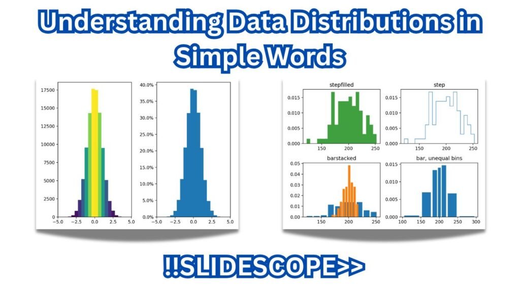
A distribution plot visually shows how data values are spread across a range.
On the X-axis, we have the possible values or intervals of the dataset — for example, customer ages, transaction amounts, or test scores.
On the Y-axis, we have the frequency or probability density, which tells how often each value (or range of values) occurs.
The shape of the plot — whether bell-shaped, skewed, flat, or multi-peaked — helps us understand patterns, central tendency, and variation in the data.
In short, it shows how data is distributed, helping analysts identify trends and outliers easily.
1. Normal Distribution
This is that perfect bell-shaped curve we all know from school.
Most of your data sits near the center, with fewer values on the edges.
📊 Example: If you measure the height of 1,000 people, most will fall around the average — say 5’6” — and only a few will be too short or too tall.
2. Uniform Distribution
This one’s super simple — all outcomes are equally likely.
📊 Example: Roll a fair dice — every number (1 to 6) has the same chance.
No peak, no curve, just flat.
3. Binomial Distribution
Think of it as “how many times can I succeed out of N tries?”
📊 Example: If I flip a coin 10 times, how many heads can I get? The results will vary, but they’ll roughly form a binomial pattern.
4. Poisson Distribution
When I first worked on customer support data, I used Poisson without even knowing it!
It measures how often something happens in a time frame.
📊 Example: Number of calls a help desk gets per hour. You can’t predict the exact number, but you can estimate the pattern.
5. Exponential Distribution
This one’s about the time between events.
📊 Example: The waiting time between two buses at a bus stop — it’s usually short, but sometimes you wait longer.
6. Skewed Distribution
Not everything in life is balanced 😅
When data leans heavily to one side, it’s skewed.
📊 Example: Income distribution — a few people earn way more than the rest, making the graph stretch to the right.
7. Bimodal Distribution
Ever seen a graph with two peaks? That means there are two groups hiding inside your data.
📊 Example: If you mix test scores from two different classes, one strong and one weak, you’ll see two bumps.
8. Log-Normal Distribution
This one’s like the cousin of normal distribution but stretched on one side.
📊 Example: Stock prices — most stay within a range, but a few shoot up really high.
💡 What I’ve Learned
The more I’ve analyzed datasets, the more I realized — understanding the shape matters more than the numbers sometimes.
Before doing fancy modeling or applying formulas, I always visualize my data first. The distribution tells you whether your assumptions even make sense.
So next time you see a weird-shaped histogram, don’t ignore it.
It’s your data trying to tell you a story — you just have to listen.
Here is the code in Python to check in Jupyter notebook or Google Colab
# Author: Ankit Srivastava
# Visualizing Different Types of Data Distributions in Python

import numpy as np
import matplotlib.pyplot as plt
import seaborn as sns

# Use a clean style
sns.set(style="whitegrid")

# Create a figure with 4 rows and 2 columns (8 plots total)
fig, axes = plt.subplots(4, 2, figsize=(12, 14))
axes = axes.flatten()

# 1. Normal Distribution
data = np.random.normal(loc=0, scale=1, size=1000)
sns.histplot(data, kde=True, color="skyblue", ax=axes[0])
axes[0].set_title("Normal Distribution")

# 2. Uniform Distribution
data = np.random.uniform(low=0, high=10, size=1000)
sns.histplot(data, kde=True, color="skyblue", ax=axes[1])
axes[1].set_title("Uniform Distribution")

# 3. Binomial Distribution
data = np.random.binomial(n=10, p=0.5, size=1000)
sns.histplot(data, kde=True, color="skyblue", ax=axes[2])
axes[2].set_title("Binomial Distribution")

# 4. Poisson Distribution
data = np.random.poisson(lam=4, size=1000)
sns.histplot(data, kde=True, color="skyblue", ax=axes[3])
axes[3].set_title("Poisson Distribution")

# 5. Exponential Distribution
data = np.random.exponential(scale=1, size=1000)
sns.histplot(data, kde=True, color="skyblue", ax=axes[4])
axes[4].set_title("Exponential Distribution")

# 6. Skewed Distribution (Right Skew)
data = np.random.chisquare(df=4, size=1000)
sns.histplot(data, kde=True, color="skyblue", ax=axes[5])
axes[5].set_title("Skewed Distribution")

# 7. Bimodal Distribution
data1 = np.random.normal(-2, 0.8, 500)
data2 = np.random.normal(3, 1, 500)
data = np.concatenate([data1, data2])
sns.histplot(data, kde=True, color="skyblue", ax=axes[6])
axes[6].set_title("Bimodal Distribution")

# 8. Log-Normal Distribution
data = np.random.lognormal(mean=0, sigma=1, size=1000)
sns.histplot(data, kde=True, color="skyblue", ax=axes[7])
axes[7].set_title("Log-Normal Distribution")

# Adjust layout
plt.tight_layout()
plt.show()