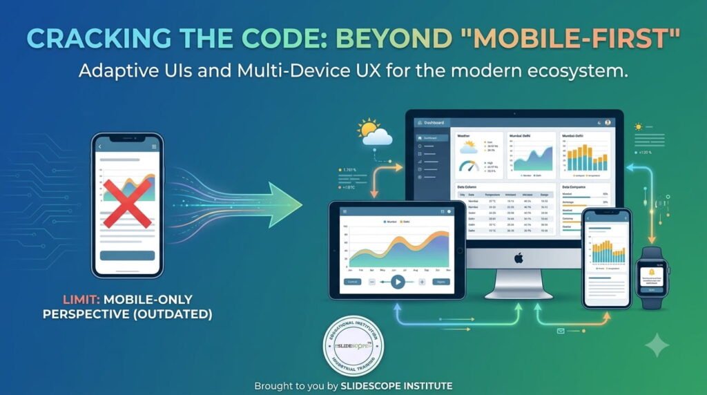
I still remember testing an early version of one of our management apps on a friend’s Samsung foldable a couple of years ago, watching the entire layout awkwardly stretch and misalign the moment the screen unfolded from phone-size to tablet-size. Nothing was technically broken — the app still functioned — but it looked like it had been caught off guard by its own device, which, functionally, it had been. That moment stuck with me, because it’s exactly the kind of gap that’s rapidly stopped being acceptable.
The line between mobile, tablet, and desktop experiences has genuinely blurred in a way that “responsive design” as we understood it a few years ago doesn’t fully capture anymore. Platforms are now actively mandating that apps support a much wider range of form factors, and developers building anything — from a native app to a WordPress-powered business site — are increasingly expected to produce interfaces that feel intentionally designed for foldables, varying orientations, and desktop-class multitasking, not just interfaces that technically “still work” when squeezed onto a different screen.
I’m Ankit Srivastava, and having built and shipped a genuinely wide range of apps and websites — several Android apps covering healthcare, education, and logistics, plus years of WordPress development for businesses across very different device audiences — I want to walk through what’s actually changed here, why it matters more than it used to, and what I’ve learned building for this reality directly rather than reading about it secondhand.
Why “Mobile-First” Is No Longer the Whole Story
For a long time, the dominant design philosophy was straightforward: design for the smallest, most constrained screen first, then progressively enhance the experience as screen real estate grew. That approach made sense in a world with a fairly clean, three-tier hierarchy — phone, tablet, desktop — where each device category behaved predictably.
That clean hierarchy doesn’t really exist anymore. Foldable phones fluidly shift between phone and tablet form factors mid-session, sometimes multiple times during a single use. Tablets increasingly run in desktop-class multitasking modes, with resizable, overlapping app windows rather than a single full-screen app at a time. Even phones themselves now regularly support split-screen and picture-in-picture multitasking as a default expectation, not a niche feature.
The practical implication is that “mobile-first” thinking, on its own, is no longer sufficient. What’s actually needed is fluid, state-aware design — interfaces that respond intelligently to a continuously changing set of conditions (screen size, orientation, window state, input method) rather than interfaces built around three or four fixed target sizes.
What I Actually Learned Building for Foldables and Varying Form Factors
Going back to that early foldable testing experience — it forced a genuinely useful realization: a layout that merely “doesn’t break” across screen sizes is a much lower bar than a layout that feels intentionally designed for each state a device might be in.
With our school and hospital management apps specifically, this mattered more than I initially expected, because the actual users — school administrators, hospital front-desk staff, doctors reviewing patient information between rooms — weren’t using a single, predictable device. Some accessed the apps on budget Android phones with small screens, others on tablets mounted at reception desks, and increasingly, some on foldables and larger-screen devices running genuine multitasking setups. Designing a fixed, single-target layout would have meant one of those user groups got a genuinely degraded experience, and in something like a hospital front-desk workflow, a clunky interface isn’t just an aesthetic complaint — it directly slows down real patient-facing work.
What actually worked was building layouts around flexible grid systems and component behavior that could reasonably adapt — rather than fixed pixel dimensions or rigid, single-column assumptions baked in early. A patient list, for instance, needed to behave sensibly whether it was rendering as a single scrollable column on a phone or as a two-pane list-and-detail view on a larger, unfolded or tablet-class screen — without needing two entirely separate versions of the same screen built and maintained independently.
The WordPress Side of This Same Problem
It’s worth saying plainly: this challenge isn’t unique to native app development. Years of building and maintaining WordPress sites for businesses taught me the exact same lesson from a different angle. A site that looked polished on a designer’s widescreen monitor during development frequently told a very different, much rougher story the moment a real visitor loaded it on a mid-range Android phone, or increasingly, on a tablet held in landscape orientation with a keyboard attached, behaving almost like a small laptop.
The businesses I’ve worked with that took this seriously consistently saw the payoff show up in real, measurable engagement — lower bounce rates, longer session times, better conversion on forms and checkout flows — while the ones that treated responsive design as a box to check late in the project consistently struggled with exactly the kinds of layout and usability issues you’d expect: overlapping elements, illegible text at certain breakpoints, navigation menus that worked fine on the developer’s test device and nowhere else.
The lesson transfers directly to today’s broader adaptive UI challenge: treating multi-form-factor support as a late-stage patch rather than a foundational design decision consistently produces a worse result, more rework, and a more fragile codebase than building with that flexibility in mind from the start.
What “Adaptive,” Not Just “Responsive,” Actually Requires
I want to draw a real distinction here, because I think a lot of teams still conflate the two. Responsive design, historically, has mostly meant resizing and reflowing content to fit a given screen width. Adaptive design, in the context of today’s device landscape, means something more ambitious: genuinely restructuring the interface and interaction model based on the specific context a user is currently in.
Layout restructuring, not just resizing. On a phone, a navigation pattern might reasonably be a bottom tab bar. On a tablet or desktop-class multitasking window, that same navigation might need to become a persistent side rail, because the interaction pattern that makes sense fundamentally shifts with more available space and a different likely input method.
Designing explicitly for continuous state changes, not fixed breakpoints alone. A foldable device transitioning from folded to unfolded mid-session is a genuinely different design challenge than simply supporting two fixed screen sizes independently — the interface needs to handle that live transition gracefully, ideally preserving context (like scroll position or an open form’s contents) rather than jarringly resetting.
Accounting for multiple, simultaneous input methods. A tablet in desktop-class mode might be receiving touch input, a stylus, a physical keyboard, and a trackpad, sometimes within the same session. Interfaces designed assuming touch as the only input method increasingly feel noticeably out of place in these environments.
Supporting genuine multitasking, not just varying screen size. An app running in a resizable, non-fullscreen window alongside other apps needs to remain fully usable at a meaningfully reduced width and height — a different design problem than simply scaling a full-screen layout down proportionally.
Practical Lessons From Actually Shipping This
A few specific things I’ve found genuinely make the difference between an app or site that merely tolerates different form factors and one that actually feels well-designed across them.
Build with flexible, constraint-based layouts from day one, rather than retrofitting flexibility onto a design built around one fixed target size. This is significantly harder and more expensive to add after the fact than to design in from the beginning.
Test on real varied hardware early, not just emulators or a single reference device. The foldable testing moment I mentioned earlier only surfaced because we happened to test on an actual foldable device — an emulator or a purely theoretical breakpoint review wouldn’t have caught the same layout awkwardness nearly as clearly.
Design your component library to be genuinely context-aware, where individual UI components (lists, navigation, forms) know how to reasonably reconfigure themselves based on available space and context, rather than maintaining entirely separate, hand-built versions of the same screen for each target device category.
Treat orientation and window-state changes as first-class scenarios in testing, not edge cases — rotating a device, resizing a multitasking window, or folding/unfolding mid-session should all be explicitly part of your QA process, not something discovered by an actual user after launch.
Why This Matters More for Businesses Than It Might Seem
For a business owner evaluating a new app or website project, this might initially sound like a purely technical, developer-facing concern. In practice, it directly affects real business outcomes. Users increasingly move fluidly between devices throughout a single day — starting a task on a phone, continuing it on a tablet, finishing it on a larger multitasking-capable screen — and an experience that feels disjointed or degraded at any point in that chain creates real friction, abandoned tasks, and a noticeably less trustworthy impression of the product or business behind it.
I’ve seen this directly in client conversations: a business that invested seriously in adaptive design consistently reports smoother user feedback and fewer support complaints tied to “the app looks broken on my device” than one that treated a wider range of form factors as a lower-priority afterthought.
Final Thoughts
The device landscape isn’t converging toward a simpler set of standard screen sizes — it’s getting more genuinely varied and more fluid, with foldables, resizable multitasking windows, and mixed input methods becoming the norm rather than the exception. Having built across native Android apps and WordPress-powered business sites for a genuinely wide range of end users, the lesson I keep relearning is the same one every time: designing flexibility in from the start is meaningfully cheaper, more reliable, and produces a better real-world result than trying to patch it in after the fact, once a rigid layout has already been built around a single assumed screen size.
If you’re looking to build genuine, hands-on skill in adaptive UI design and multi-device development — the kind of practical judgment that only comes from actually testing across real, varied hardware — that’s exactly the kind of project-based training we focus on at SlideScope.com.

Ankit Srivastava is an IT trainer, technology educator, and digital skills mentor with expertise in programming, data analytics, AI, and software development. He has successfully trained thousands of learners, with more than 10,000 student enrollments on Udemy. His practical teaching approach empowers students and professionals to build in-demand technical skills. Colorstech channel where Ankit posts video tutorials has more than 8000 Subscribers.