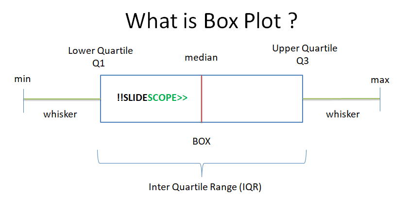
A box plot is used to visualize 5 values in a dataset for the selected column(s):
- Minimum Value
- First Quartile or 25%
- Median (Second Quartile) or 50%
- Third Quartile or 75%
- Maximum value
Box Plot is also known as Box and Whisker Plot.
Steps –
-
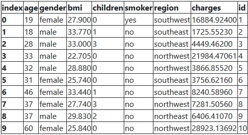
- Load the dataset using Pandas dataframe
- Select any column to visualize
- Plot boxplot using Pandas
OR - Plot boxplot using Seaborn
Python Code :
import pandas as pd
#load data
data = pd.read_csv(‘insurance.csv’)
data.head(10)
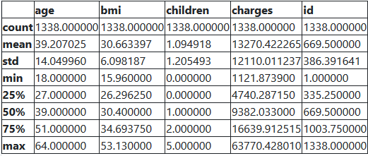
>> data.describe()
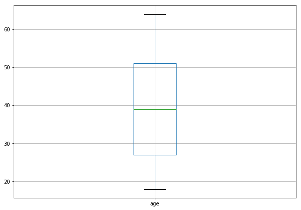
# In pandas boxplot one attribute, column is required to plot boxplot
# Column can take name of one column of the dataset or the list of columns
data.boxplot(column=[‘age’],figsize=[10,7])
# We can group data as well.
data.boxplot(column=[‘age’], by=[‘gender’], figsize=[10,7])
Boxplot Using Seaborn Library
# import the library seaborn as sns
import seaborn as sns
from matplotlib import pyplot as plt
#set the style of seaborn as whitegrid
sns.set_style("whitegrid")
# Seaborn takes minimum of 2 attributes to plot a boxplot
# x = name of column and data = dataframe
plt.figure(figsize=(12,6))
sns.boxplot(x = ‘age’, data = data)
What is Outlier in Boxplot ?
Outlier – if a data point is below Q1 – 1.5×IQR or above Q3 + 1.5×IQR
Here IQR is the interquartile range, which you can see in the featured image.