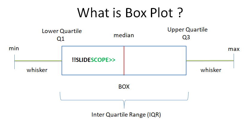
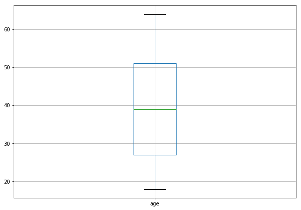
A box plot is used to visualize 5 values in a dataset for the selected column(s):
- Minimum Value
- First Quartile or 25%
- Median (Second Quartile) or 50%
- Third Quartile or 75%
- Maximum value
Box Plot is also known as Box and Whisker Plot.
Steps –
-
- Load the dataset using Pandas dataframe
- Select any column to visualize
- Plot boxplot using Pandas
OR - Plot boxplot using Seaborn
Python Code :
import pandas as pd
#load data
data = pd.read_csv(‘insurance.csv’)
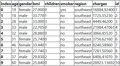
data.head(10)
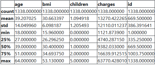
>> data.describe()
# In pandas boxplot one attribute, column is required to plot boxplot
# Column can take name of one column of the dataset or the list of columns
data.boxplot(column=[‘age’],figsize=[10,7])
# We can group data as well.
data.boxplot(column=[‘age’], by=[‘gender’], figsize=[10,7])
Boxplot Using Seaborn Library
# import the library seaborn as sns
import seaborn as sns
from matplotlib import pyplot as plt
#set the style of seaborn as whitegrid
sns.set_style("whitegrid")
# Seaborn takes minimum of 2 attributes to plot a boxplot
# x = name of column and data = dataframe
plt.figure(figsize=(12,6))
sns.boxplot(x = ‘age’, data = data)
What is Outlier in Boxplot ?
Outlier – if a data point is below Q1 – 1.5×IQR or above Q3 + 1.5×IQR
Here IQR is the interquartile range, which you can see in the featured image.

Ankit Srivastava is an IT trainer, technology educator, and digital skills mentor with expertise in programming, data analytics, AI, and software development. He has successfully trained thousands of learners, with more than 10,000 student enrollments on Udemy. His practical teaching approach empowers students and professionals to build in-demand technical skills. Colorstech channel where Ankit posts video tutorials has more than 8000 Subscribers.